
hypothetical branding exercise for subject
architectural practice b
To penetrate Abu Dhabi’s architecture market, our brand engages with the two prominent languages in the region – English and Arabic. Our practice is named Atelier Akhbar.
“Atelier” in English means an artist’s studio, work room, or a workshop.
“Akhbar” is a culmination of two common words in the Arabic language.
1.
Akbar (in Arabic: ر ب ک ا ) is the Arabic elative of Kabir “great”, as used in the Takbir: Allahu Akbar (God is Great), an Islamic exclamation called the Takbir in Arabic.
2.
Ahbar refers to: An Arabic plural word (Arabic: ر ا ب خ أ) meaning news, and therefore present in the titles of many Arabic newspapers, television newscasts and so on.
This word therefore lends itself to two immediately recognized definitions. The Arabic spelling of “Akhbar” chosen (Arabic: ر ب ﻩ ک ا) is an alternative to the two words mentioned above as to avoid controversy and at the same time allowing multiple interpretations.
The logo is derived from the cursive script of Arabic calligraphy. It is made up of clean straight lines with strict curvatures extracted from the sections of three varying circles. With the distinctive straight lines and curves that form the word “Akhbar” our logo suggests the brand’s engagement and understanding towards Abu Dhabi’s Arabic origins, locality and culture without losing sight of the country’s need for further modernization. This ensures our brand logo to be relatable to our Arabic clients while maintaining the appeal of an international design firm – embracing the pragmatic needs of making architecture and respecting identity and culture. The logo is a gesture of our permanence in this region and it is also distinctive enough to stand out within a crowd of international firms vying for architectural opportunities in Abu Dhabi.


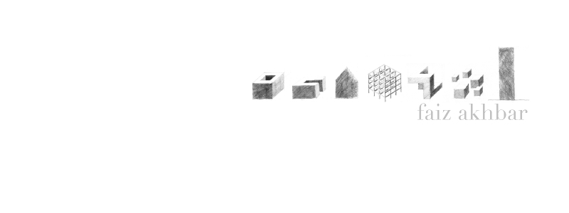
faiz akhbar (kuala lumpur)
peter muhlebach (melbourne)
shyn cheah (melbourne)
chern wong (tokyo)
max li (melbourne)


 a single train line that separates the two worlds that are impossible to be so close to each other. as juxtaposition takes place at the turn of the head, the experiences of walking across both of them, seems itself a bizarre unification of the polarities of tokyo
 the schizophrenic identities, as one living humbly in the aristocratic, hierarchical system, but also as one that lives in the self indulgent, violent and pragmatic Shogun system
 commercial message displayed in opposite aesthetics. on one hand, the essentialization of the brand towards a deliberate purification of the aesthetic that becomes the appeal. an on the other hand, an overwhelming display of information that is transformed into an aesthetic of its own.


